Headlines are critically important.
They're one of the easiest things to change, and yet they have one of the biggest impacts on whether your landing pages gets read (or converts).
But here's the problem.
They can't do it all on their own. And there's a few things that need to happen properly BEFORE people even get a chance to read your headline.
Otherwise, people aren't even clicking to your page in the first place.
Here are three of the most common landing page mistakes and how you can fix them.
Mistake #1. Yawn-Worthy Offers
The elements on your landing page are important. They have a direct impact on conversions.
But what's compelling people to even visit that landing page in the first place?
Another basic free trial, or boring free consultation?
Not likely.
Wordstream analyzed $3 billion in advertising spend to understand what separated the top performers – those cranking out 10%+ conversion rates – from everyone else struggling with an average 1-2% (or less).
It wasn't because they used green buttons instead of an orange ones.
Instead, it was because they all used a “massively differentiated offer”.
Their initial value proposition was so unique, so interesting, that the same old free trial or consultation couldn't keep up.
What's an example?
How about this unexpectedly awesome one from hardware store Lowes:
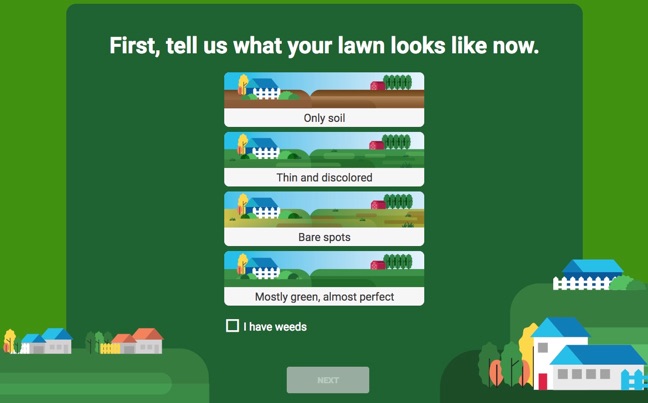
They provide a complete lawn care maintenance plan with a few clicks of your finger.
By entering only the most basic information, you get customized results for your lawn type and climate in order to maintain a beautiful looking year-round with minimal hassle.
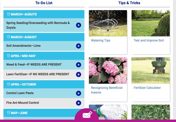
This is a perfect example of a “massively differentiated offer”, because it provides extreme utility (or usefulness) to a customer by solving a pain point in an unexpected but enjoyable way.
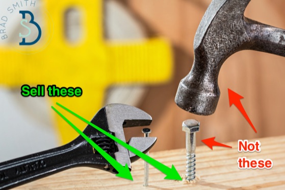
Let's be honest: nobody cares about hardware store tools. (Except depressing old suburban white dudes.)
Lowe's understands this intimately. So instead, they sell the solution – like a yard in this case, or a hole that you'll use to hang your family's picture – and not the tools themselves.
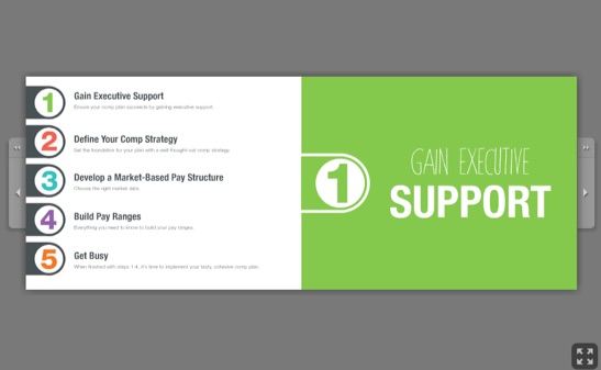
PayScale is another one of my favorite examples because on the face of it, their business isn't very sexy (they provide salary profile database and software). Yet that doesn't hold them back from pumping out tons of interesting interactive content pieces.
One example includes a guide to compensation plans; a beautifully designed walkthrough that informs while also somehow managing to entertain with a light, casual, friendly tone.
Two very different examples so far, but they share a lot in common. Specifically, they're both:
- Useful: Alleviating customer problems with a quick and simple guide or tool.
- Timeless: The offer isn't tied to an expiration date, or trending topic that will die out.
- Mass appeal: Both offers are insanely easy to promote. In other words, people actually care.
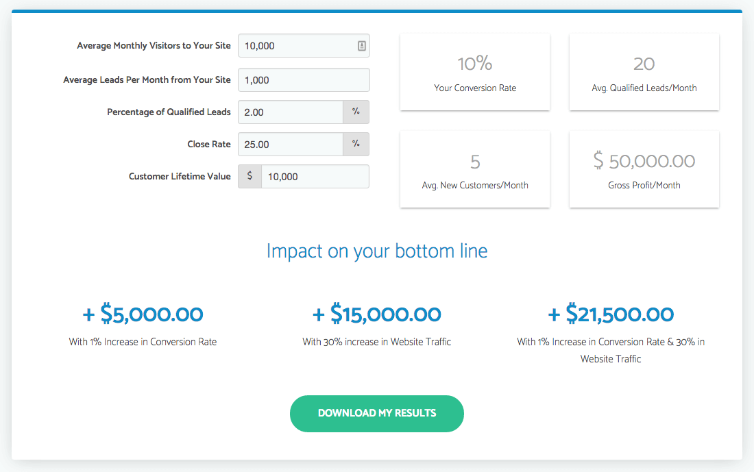
Marketing agency IMPACT has created another excellent example with their inbound marketing ROI calculator.
People reading this blog already know all about inbound marketing. However compared to the real world (you know, like the other 95% of the world's population that doesn't work in software or marketing), MOST people have no idea what it is (or why it's beneficial).
That's why IMPACT's ROI calculator is so powerful. It instantly distills the primary benefits of all that content work down to few important numbers.
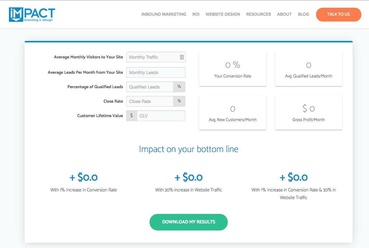
Pricing with Confidence says the key to getting the price you want, is to sell value through its quantitative benefits. That means showing a positive change in conversions, traffic and potential sales, which should outweigh the costs of your services.
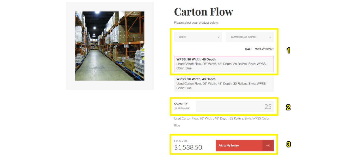
A final example comes from my agency's client, United Material Handling. On the face of it, they're another 'boring', unspectacular case.
However what they did already have in store was an internal system that scanned every single piece of equipment arriving and leaving their location. That means they knew what they had on hand.
On-hand product availability is one of the primary purchasing motivations for their clients. So we wanted to give that visibility to customers, too.
Directly from their website, customers can now search a real-time inventory system to get an idea of (1) if they have their product sizing, (2) if it's in stock, and (3) what a cost estimate might look like – based on quality.
The common thread throughout all of these examples is to:
- Identify what makes the company truly unique. What do you have that no one else does? Whether that's data, creative resources, technology, or whatever.
- How can you package that in an interactive way that enhances the experience and usefulness. For example, using data to create beautiful infographics like PayScale does is a much better use than just expecting people to wade through endless Excel workbooks.
An interesting offer, while the first step towards giving people a reason to care, is just the beginning.
The next mistake is another that's all-too-common, yet rarely talked about.
And that's a shame, considering it's one of the primary reasons 74% of people leave your website within five seconds.
Mistake #2. Sluggish Page Loading Times
It doesn't matter how good your headline is, if people don't stick around long enough to read it.
People equate page loads with usability in most cases.
And they're right. But it affects much more than just people's opinions.
It's one of the primary reasons people leave your website, with an estimated 50% leaving if it's not up within only three seconds.
It negatively affects conversions. Meaning lost revenue.
And it negatively affects SEO. Meaning less visibility.
The first step is always acceptance.
If you're relatively tech-savvy, you can pull up Pingdom to get a complete reading of your site.
If you're less so, Google also provides an excellent, easy to use option that will give you a breakdown of speed issues holding you back (along with a few simple tips to fix each one).
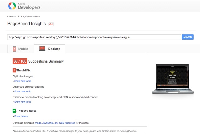
Many times you'll experience poor page loading due to bad code. 'Bloated code' full of extra (or simply bad) stuff can require significantly more resources.
In any case, fire your developer.
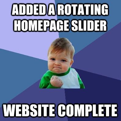
Just kidding. In fact, it might not be their fault. Remember that awesome slider (sarcasm) you and the other department heads LOVED. They're notoriously terrible for usability, conversions, and you guessed it – speed.
One of the most common speed issues we see deals with images.
They're too big. There's too many of them. Their file size is 3GB each even though it's only being used for a 150x150px box.
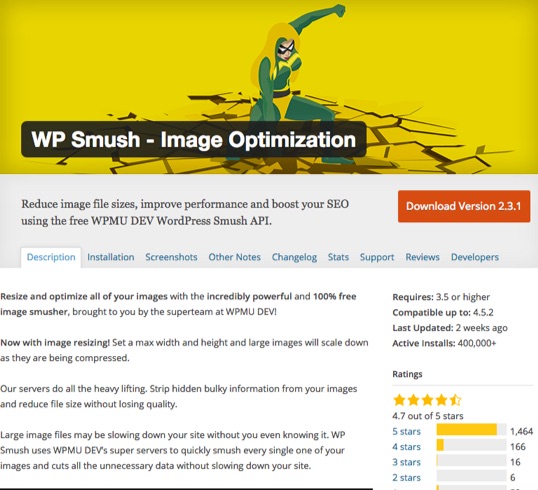
In theory, you should crop and scale each and every single photo for the exact space it's going to fit on your website. But at the very least, you should also compress them with a tool like Compressio.io or a WordPress plugin like WP Smush.
(Don't even get me started on video. Just use Wistia already.)
Last but definitely not least, get off Bluehost. Seriously. It sucks.
No matter what all those hippy self-help bloggers try to tell you. (It ain't a surprise that they also pay out $5 million to affiliates in a year.)
The best optimized website on a terrible server will still be slow. Which means saving a few bucks on cheap hosting will almost definitely cost you more in the long run due to lost search visibility or lost sales.
Especially if you're running on WordPress, which while awesome, still needs some tweaks. If you aren't a server admin black belt, just let someone else manage it like Pagely or WPengine.
Mistake #3. Cluttered, Confusing Design
50 milliseconds.
That's the time it takes for a Lamborghini Aventador to switch gears (fun fact!).
It's also the time it takes for people to form a first impression of your website, leading to them staying or bouncing.
The bulk of that split-second decision is decided on, you guessed it, your design (a whopping 94% of the time).
The key to providing a happy first experience in those first few critical moments is to not make people think. Each landing page should be clean, simple, and clearly organized to help visitors immediately understand where everything else and how to navigate around.
Start with the experts to get those creative juices flowing. Go check out Unbounce's landing page templates to get some basic layout inspirations for how yours should look.
For example, here's a random one that follows this clean and simple approach.
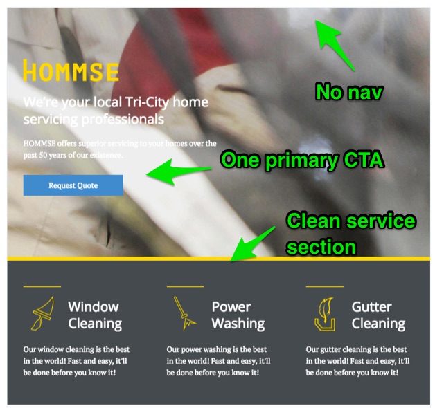
There's no navigation listed to distract users from navigating to additional pages. There's only one primary CTA button that's big and bold. There's also a simple, clean services section to help support whatever the page is about.
Another place to get ideas is Themeforest's landing page section. Look up the best sellers in the last 12 months to see the cream of the crop.
For example, under their RGen landing page product is this event page:

Again you see some good design principles in action. The CTA form has a different colored background to help draw your eye line. There's a big, bold headline section with a countdown timer underneath to create urgency. And there's a logo section at the bottom where you could add credibility-boosting partners, or highlight sponsors of the event.
The important thing to note here is that they've expertly used the colors and layout to give you a visual hierarchy of where your attention should go first: (1) CTA first, (2) then headline with countdown before (3) finally the logos on the bottom.
Designers who excel at print, even big-budget ad campaigns or magazines, are average web designers at best.
The reason being? The web is an interactive medium, where design = function, not art.
Here's another example from the aforementioned United Material Handling, this time with an emphasis on how design tells the user what to do next.
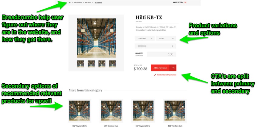
Breadcrumbs help visitors figure out how they got here (in other words, where in the website's organization they're at currently). The product option dropdowns feature different shading that's more subtle than the CTA's. And even though there are two CTA's with the same color, the size, style and placement help you tell which is the primary and which is the secondary.
If website visitors make up their minds about your site within 50 milliseconds of landing on page, they literally don't even have time to think, analyze, or hunt for information. Because if it takes much longer than that, they're gone.
Conclusion
The individual elements on a landing page can influence conversions.
But A/B testing the color of a button is irrelevant if visitors aren't even getting to your page or leaving after just a few fractions of a second.
You need a differentiated offer to compel people to click in the first place. Your page loading times need to be instant so people stick around. And your overall page layout needs to be cleanly organized so that visitors immediately know what they're supposed to do.
Fix those things first, making sure that you're getting visitors coming in droves and sticking around long enough to read what's on each page, before obsessing too much over your headlines, hero images, or CTAs.
About the Author: Brad Smith is a founding partner at Codeless Interactive, a digital agency specializing in creating personalized customer experiences. Brad's blog also features more marketing thoughts, opinions and the occasional insight.
No comments:
Post a Comment