Pouring over big data isn't the goal.
Instead, analytics are supposed to give us a way to find out where the bottlenecks or gaps are occurring, and how to best prioritize our next move (allocating resources appropriately to get the job done).
Data, by itself, is meaningless.
It gets worse with added complexity, in a world where there's no shortage of data–vomiting dashboards in most startups and executive HIPPO offices.
Problem is, tracking hundreds of KPI's can quickly become overwhelming (at best) or completely baffling (at worst).
You can't figure out where to start, or what to prioritize when faced with analysis paralysis.
Here's how to keep things simple, with the help of an old school copywriting framework, to keep the focus on action (instead of reporting).
The Pernicious Problem with Analytics

Not always intentionally, but it can be bent or molded to offer up compelling narratives.
Any hockey-stick looking graph can plucked from obscurity to be used to WOW clients, impress bosses, and even silence your own inner chatter.
If that inherent bias ain't bad enough, raw data doesn't always give you the full picture of an activity.
For example, what's the value of this very blog you're reading?
Is it 'thought leadership'? 'Brand awareness'?
Cool. How can you justify it, put a value on it, and sell it to said bosses or clients?
Compare it to say, AdWords. THAT'S easy to sell. People look for something specific. They click and convert. Almost immediately.
What's the ROI of responding to angry customers on Facebook? Good luck.
Point is, data doesn't always provide the full picture.
Not taking into account these things, while over prioritizing others, can be a recipe for disaster.
Fortunately, there's a simple way you can start solving this problem. And it comes from an unlikely source: copywriting.
What Copywriting Can Teach You About Analytics
Good, old fashioned direct response copywriting has been around since the 60s.
For over 50 years since, your mailbox has been chock full of crap you don't need wrapped in clever, hyperbolic language.
Despite that malicious use, there is a simple copywriting ethos useful for outlining a set of activities that lead strangers to become customers.
AIDA: or Attention, Interest, Desire and Action.
The idea is that you need to start by grabbing people's attention, slowly build interest by developing trust, which creates an internal desire to obtain the solution your widget solves, before finally taking action to fix the problem or gain the solution.
When applied in the context of site analytics, it represents a simple sales funnel (or dare I say, customer journey), where the goal is to build brand awareness, keep people on-site longer to develop trust, leading to the small commitments that eventually lead to bigger ones.
Here's how that looks in plain english:
- Attention: People coming to your website, from first-time visitors to repeat ones.
- Interest: People sticking around, reading blog posts, diving deeper into services pages, and more.
- Desire: People converting on useful events or 'micro-conversions' that lead to sales.
- Action: People giving you their credit card to become a customer, or giving you their information to become a sales-ready lead.
Now that you have a place to start, let's see how to set this thing up.
How to Get Started Using AIDA Analytics
Dave McClure's Startup Metrics for Pirates is an excellent framework that espouses selecting a few metrics (in favor of gigantic dashboards) to focus your attention.
Selecting one or two (read: a few) actionable metrics for each can give you a rough idea of how you're doing, and where you're falling short.
The focus is on the big picture, which should make it easier to know where to start or focus your limited resources for maximum effect.
And then from there, you can always dive deeper into the weeds too.
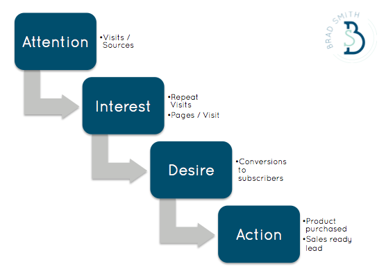
For example:
- Attention: Visits / Sources gives you an indication of how well your marketing channels stack up, and how well your promotional efforts are performing.
- Interest: Repeat Visits or Pages/Visit lets you know if people are digging your stuff, interested to learn more. Or if they're bouncing immediately after getting to your site.
- Desire: Micro-conversions like subscribers are useful in obtaining small commitments from people, gaining permission to continue nurturing those leads over the long term.
- Action: At the end of the day, you're doing this for products purchased or sales ready leads.
Setting up a basic dashboard for these actionable metrics takes literally seconds.
In Google Analytics, create a new dashboard and get started by clicking Add a Widget.
Up pops a few options to choose from. For example, the basic metric option will show you just that: a number. While a timeline, table, or pie will give you a more complex figure that allows you to compare and contrast different elements.
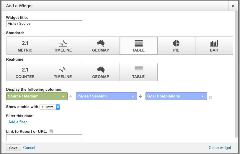
Adding up a few of these widgets should give you a simple dashboard so you can see actionable metrics at a glance. You can even kinda align them in funnel or journey format, from left to right, so that it logically makes sense when viewing from afar.

Kissmetrics will obviously also do this (and much more), allowing you to instrument events based on your unique funnel steps. An additionally nice feature is that it will highlight conversion steps in between too, so that you can immediately see how many people might be progressing from one 'stage' (like Attention) to another (like Interest).

Starting with a simple framework like AIDA can simplify your life. But the real value will be in digging deeper to glean insights over time.
Here's how.
How to Glean Insights from Your Simple Analytics
A simple analytical framework, like the copywriting AIDA in this case, helps add context to raw data.
It also keeps your focus on the important things that affect your bottom line, like a few key Marketing KPI's and the Business Metrics those influence. That way you don't get sidetracked worrying about or overanalyzing vanity metrics like links, rankings or press mentions (which tend to be more Leading Indicators anyway).
Then, you can begin to glean insight from this data by comparing results over time.
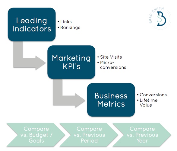
For example, look at your own historical trends over the past period or prior year to rule out seasonality for cyclical businesses.
What are the patterns? Is your performance in certain areas worthy of the budgeted resources? Or were your goals and objectives a little too ambitious to begin with?
Viewing data in context like this also helps you spot interesting tidbits of information that you weren't previously privy to, and should explore further.
Like, “Oh hey, look at how much more engagement we get from Facebook users. Maybe Facebook doesn't suck so bad after all”.

Expecting the same conversions from Facebook as Google AdWords may not be logical.
Facebook (and social media) is serendipitous, meaning people find stuff by luck, chance, or timing. Compare that to AdWords, where it's more likely that people have intent to purchase (because after all, they're typing in exactly what they're looking for), and you can see where the error in logic happens.
But when you can see that Facebook visitors tend to be almost twice as engaged, you can adjust campaigns accordingly. Instead of expecting the same conversions from Facebook, let's try using those seemingly interested and loyal visitors to help us amplify our message and reach more people.
Digging into channel comparisons like this, after viewing it in the context of a larger framework or funnel, gives you greater insight behind individual campaign performance.
When you stack them up against each other, assessing how results should dictate future budgets, you're a little better prepared.
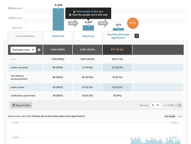
Sure, Campaign A might have delivered at a higher rate than Campaign B. But maybe it can't scale as well or isn't as cost effective, resulting in fewer (+ more expensive) total leads over time.
When you have a simple framework in place that prioritizes actionable metrics over vanity ones, you should be able to draw a straight line from your most profitable customers, through the campaigns that generated them, and how your website pages or traffic channels should adjust accordingly.
Conclusion
Raw data is meaningless.
There's too much of it, and it quickly can become mind numbingly exhausting when you attempt to piece together all the clues.
Simplicity is, well, the simplest way to make sense of it all.
Applying a basic framework to your funnel, like copywriting's age-old AIDA, quickly cuts through the clutter, adding context to help you figure out where to begin.
From there, a focus on fewer metrics that prioritize action over vanity will keep you (and your team) aligned on what really matters to move the needle for your organization.
Because you only have so much time, energy, attention and money to go around.
And the only thing worse than spending those on the wrong things, is to squander them going in circles without committing to anything at all.
About the Author: Brad Smith is a founding partner at Codeless Interactive, a digital agency specializing in creating personalized customer experiences. Brad's blog also features more marketing thoughts, opinions and the occasional insight.
No comments:
Post a Comment