It's the great marketing paradox. We spend hours brainstorming and months testing the copy of our calls-to-action, but whether we ask our users to Sign Up Now, Start a Free Trial, Get Started, Request Access, or Learn More, all we really want them to do it click the button.
Just click the button.
So why do so many of our quality leads fail to comply with our simple request? The way your CTA button is set up on a landing page is just as important as the CTA itself. Otherwise, it's a button to nowhere.
Make your CTA pop on a pretty page
Visual appeal is everything. Before they see your CTA button, your landing page is the first impression your potential customers will have. Choose attractive, simple imagery – if your page is cluttered, your visitors won't know where to look. Color scheme also is important: Using complementary but contrasting colors help a page to pop.
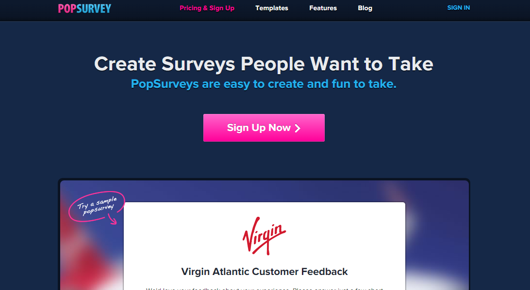
Notice how the below example from PopSurvey is coordinated with shades of blue, allowing the pink in the logo and CTA to pop out on the page. The secondary CTA, “Pricing & Sign Up” in the header is a slightly duller pink that still stands out but doesn't distract from the main call-to-action button.
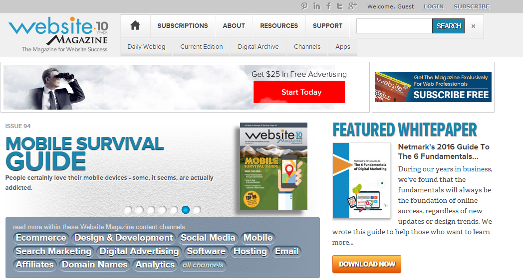
Ensure your page is easy to read and draws the attention of your customers' eyes – don't make them strain to read the text. The following landing page from Website Magazine is cluttered, has too many distracting colors, and small text. It's impossible to know where to look!
Get to the point
Customers won't have the patience to stay on your page if they don't know what you're offering. Use clear, strong wording to elicit the quick reactions that all good Calls-to-Action invoke.
Active verbs like “join” or “discover” can make people feel like they'll be a part of something or learn something new. Negative questions like “worried?” and “confused?” can tap into human fears – always an attention-getter. And make it personal and urgent – use pronouns like “your” or “my” to convey ownership, as well as time-sensitive words, as in “Get my free newsletter now.”
Dollar Shave Club is the perfect example of this. They speak to men (notice the “No commitment”) in a take-it-or-leave-it offer. Do it or don't. Either way, it's impossible to miss that big CTA.
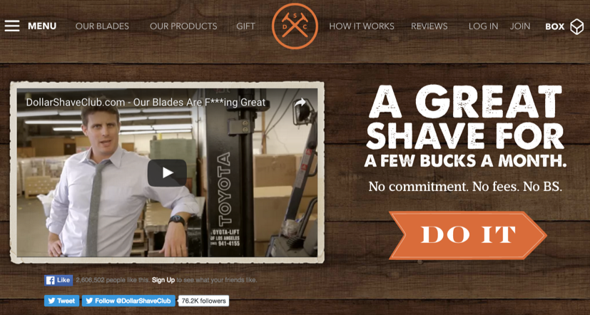
The copy here is also fantastic. It flows well, the value proposition is clear, and each sentence subsequently gets shorter up to the CTA.
At Socedo, one of our landing pages, is frill-free. We're still A/B testing variations around “Start My Free Trial” or “Start My 14-Day Free Trial.” Regardless, previous testing has confirmed that the phrase “Free Trial” is crucial to our CTA buttons. It's simple and to the point, and users know exactly what will happen when they click the button. No matter where you look on our site–the landing page, the navigation, or the blog–you'll see a blue button with the “Free Trial” copy.
But just like any marketing strategy, you should always be A/B testing. What works for one brand might not work for another, and things can change over time.
Lead to the button with benefits
Drive more leads by offering your unique selling point. When a customer clicks on your CTA button, they should know why it will benefit them. Start with a confident headline on the page that conveys a key value you offer, and support it with a subhead that explains it. Follow with clear button copy that encourages users to claim these benefits.
If you're like everyone else – boring and wordy – you won't get your customers to pay attention or even to think about clicking your CTA. Add personality, emotions and enthusiasm to help draw in customers.
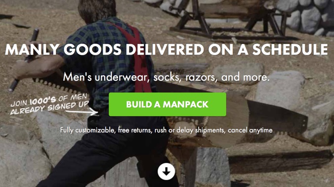
This landing page from Manpacks is fantastic and hilarious. It has a header with a clear benefit, in this case convenience on men's essentials. Then the subhead explains exactly what Manpacks offers. By the time the user reaches the CTA button, they already know what they are going to “Get Started” with.
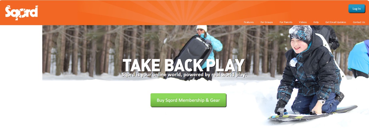
Sqord is a fitness and game tracking wristband for kids. Their landing page isn't bad. It has a coherent color theme that reflects the audience and the product, the button pops, and it gets to the point. The headline is catchy but not very specific, and the subhead only provides a few more surface-level details: “Sqord is your online world, powered by real world play.”
By the time the user reaches the button text “Buy Sqord Membership & Gear” it's hard to know what they're actually buying. Is it the wristband, the app, or both? And why should I care?
Instill fear of missing out
You always want what you can't have, right? It's all about urgency. Customers hate missing out on a short-term offer. Focus on deadline phrases such as “limited time” or give them and end date. Add exclusivity to your product, when appropriate, with phrases like “while supplies last.” And CTAs that save money will always be a winning tactic. Customers can't ignore it.
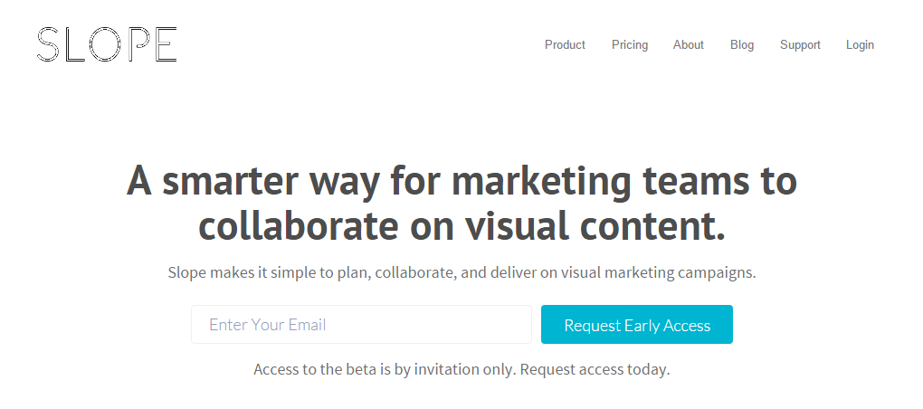
This landing page from Slope, a visual marketing platform, creates FOMO (Fear of Missing Out) by implying only a limited number of people will be allowed access to the beta. In addition to avoiding this negative, the button creates a positive experience of exclusivity. If you're one of the select few who request early access, you'll be part of the inner club–the talk of the town at your next marketers' get-together.
Be creative
You'll probably notice a pattern to the successful landing page CTAs mentioned here. They all have a high-benefit header, an explanatory subhead, and a button with active verbs. They all have a coordinated color palette, with the button standing out. They all get right to the point.
Most importantly, they all have some level of creativity. You can read as many prescriptive tips for CTA buttons as possible, but at the end of the day, it's the unexpected element of your page that will give you the edge for higher conversion rates.
About the Author: Aseem Badshah, Founder and CEO of Socedo. Socedo helps sales and marketing professionals leverage social media data to discover, qualify, and nurture leads, automatically.
No comments:
Post a Comment