Marketing promotion sucks when you treat people the same.
That goes for conversions, and it goes for advertising too.
But the minute things start to go awry, people start messing with their landing page headline or ad descriptions.
As if those tiny, miniscule elements are the primary reason traffic's not comin' or visits aren't convertin'.
The best landing page, optimized 100% correctly, can't make up for the wrong audience seeing that message.
Ad campaigns are already difficult. But the good news is that you don't need to possess ninja PPC skillz.
Instead, here is a dead simple way you can isolate where problem areas might pop up and stop them dead in their tracks.
When 'Best Practices' are Good Enough
Commonly accepted best practices are a starting point. The tip of a metaphorical iceberg.
They get all the attention and ink online. But there's a mountain below just waiting to sink your campaign.
On a GREAT day, landing pages convert around 10% of visitors (and those are the 'uncommon', special ones that vastly outperform all the rest). That means the majority of page visitors are doing, well, anything else besides converting.
Slapping on a different ad-description isn't going to budge that number. It won't change the fact that those people simply aren't ready to buy. It might get you from 6-7%. Which is great!
But in a world where over 50% of all customers interactions follow a 'multi-event, multi-channel' journey that takes various touch points prior to converting, we should look beyond tactical 'best practices' to make sure the entire funnel aligns to deliver the best conversions for our buck.
Managing the growing complexity is a top priority for marketers, with most juggling anywhere from 5 – 31 separate tools to manage messaging in a multi-channel marketing environment.
This can be best illustrated with the help of Google's Customer Journey to Online Purchase, which shows how a typical customer's journey might look (including which channels influence which parts) for most industries. Yay visuals!

The point is, there are many things involved in a single conversion. Whether we're talking about a product purchased or lead generated.
Unfortunately, ad campaigns today can't be simple, static paths from New Visitor -> Conversion. Not in a world where it takes a minimum of 6-8 customer touch points prior to conversion. Or when your most profitable customers are NOT the ones who visit your site 1-3 times, but 14-20 before signing up.
Today's ad campaigns are more like a delicate system of variables that depend on each other for success. (Enter your best 'synergistic' MBA speak here.)
Making sure those things come together harmoniously is the best way to boost conversion rates for the long-term.
Here's how.
1. Create Different Ad Campaigns for Each Customer Journey Stage
Ad campaigns should align with an appropriate stage of the sales funnel. Same as any inbound deliverable like an infographic, offline tradeshow, or other campaign.
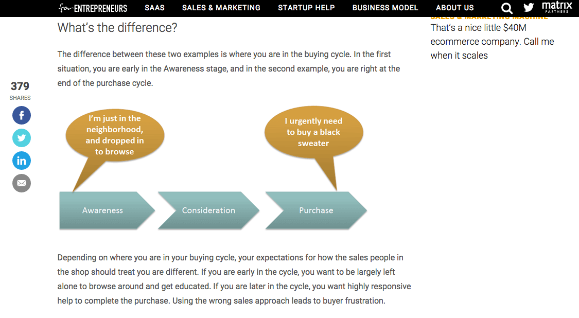
You know, that whole Awareness, Consideration, Decision bit?
(If you have NO idea what I'm talking about, read about the buying cycle and triggers from David Skok. And then spend another 20 minutes reading everything else he writes – it's worth it.)
Ad channels (and even different campaigns on the same channel) can then be used for different purposes, whether that's driving new sales to generating leads or simply boosting awareness. The opportunities are vast, but the execution needs to be precise.

Let's start with generating initial awareness to see how this works.
Demand Generation
The goal here is to bring in new, targeted visitors. Obviously.
Problem? Nobody knows who you are. And frankly, they don't really care. They haven't yet become aware that they have a need for you yet.
So help them. Literally.
Start with their daily life. What issues pop up, take too long, or cause them frustration (that can also possibly tie back into your widgets)?
Listen:
Consumers ignore 86% of display ads. And those average banner ad click through rates are a dismal 0.1%. It ain't easy out there.
Botching this jeopardizes everything else. So your value proposition needs to be awesome. Not good, or great. But, “Holy s$*% I need to [click this link / read this post] right now”.
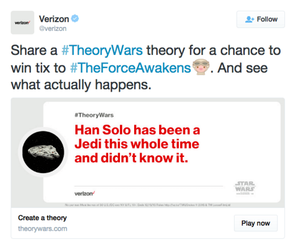
Typical display ads, AdWords, and Facebook are well tread options. So let's look at new, fresh examples like Twitter and Instagram. Less competition typically = less expensive = higher return on ad spend. And the principles are the same, regardless of channel.
For example, let's say you're trying to get the attention on Twitter. Instead of simply promoting your account (and making it all about you), solving a huge pain point or even providing a fun distraction can be enough to start introducing your brand to consumers.
The best social ads at this stage also 'blend' in with the content people are already consuming. You know, like that whole native advertising thing. For example, this one from I.D. Sarrieri is very Instagram-ish – selling a mood or theme featuring their products.

Find this one, and many more great Instagram ad examples here.
Last but certainly not least, is your headline.
The best headlines are a crystallized version of your value proposition, and they tap into some deeper primal motivation to grab maximum attention. Bnonn's SHINE headline formula is a great way to get started, giving you the 'essential' ingredients like Specificity and Immediacy that are critical to getting people to take action.
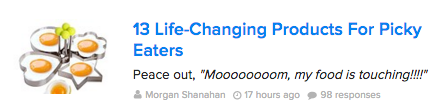
You can also study the masters like BuzzFeed, who crank out brilliant headlines day-after-day that can be templated for re-using later. For example:
This one might look like:
- # + [Perfect Adjective] + [Noun/Keyphrase Solution] + [To/For/Like] + [Fix Your Undesirable Thing]
Lead Generation
Once you've captured attention, the next step is to get them interested.
You do that by constructing a 'bridge' between their problems or pain points, and your widget which can ultimately solve those things for them.
One of the most popular techniques here is some kind of 'lead magnet' to generate a micro-conversion like a basic email address. Chances are, you're familiar with all the usual suspects like eBooks, webinars, checklists, and more.
But 'content' based offers can mean much more.
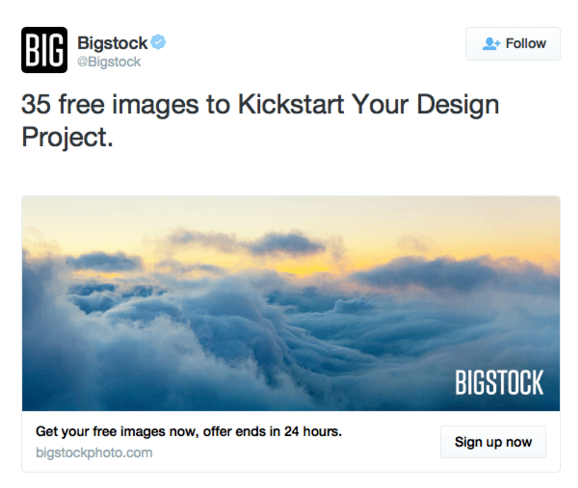
For example, most designers are starved for stock photos, especially with the exorbitant costs at the well known sources.
Here, Bigstock is providing 35 free!
(Here are a few more Twitter ad examples to browse for inspiration.)
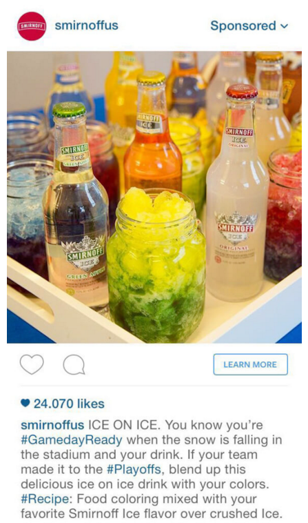
Even something as simple as a recipe could work wonders because it blends (pun intended) an offer to get attention with the products they'll need (and can purchase from you).
Smirnoff's example below is a perfect example of bridging the gap between those two worlds.
Closing Customers
By this point, prospects should know who you are and at least have some interest in your product.
Otherwise, we run into that original problem of trying to convert cold, unaware leads (which all of the best tactical practices in the world can't help).
The key? Make them an offer they can't refuse. Especially if switching costs are an issue.
For example, MailChimp executes brilliantly by running a competitive offer to Constant Contact peeps with a free three month offer. That should help soften the blow of having to move all email templates and contact records, while also giving those people enough time to settle in with the service.
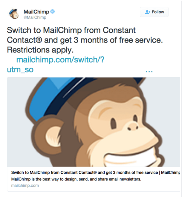
(The actual content and CTA looks a little sloppy, but the overall offer is great.)
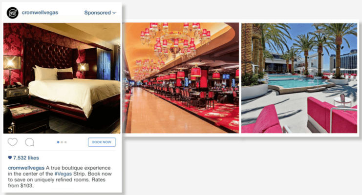
Admittedly, selling on Instagram is a, well, tough sell. It's still early days, and the channel is mostly known for brand awareness.
But still, the Cromwell in Las Vegas does as good a job as any, highlighting their attractive property in a multi-ad set with an appropriate CTA.
If you've done all the hard work up to this point (like getting awareness, building interest, and developing trust), the sales offer should be simple and straightforward.
A great offer or promotion can help, but shouldn't be required to get people to open up their wallets.
But if it is still difficult or damn near impossible, this next section can help.
2. Pinpoint & Upgrade Underperforming Stages
Creating different ad campaigns for specific sales funnel stages can help illustrate potential gaps, making it easier to break down exactly where you're excelling (or falling short).
That way instead of overreacting and making rash conclusions, you can start measuring those micro-conversions between stages or steps to find leading indicators of success.
For example, experiencing low sales but demand seems to be there? Insert more lead gen and nurturing campaigns into the mix to bridge that gap. The end result, should resemble a complete 'customer journey' that seamlessly moves people from one step to the next.
But what if those things check out, and still nothing. You've got ad campaigns targeting each step, and they seem to be performing well. Except for that whole sales thing.
Break your ad campaigns down even further into the individual variables that dictate success.
Google AdWord's Quality Score is kinda the gold standard for using algorithms to award and set pricing in an auction based ad system. Facebook has also been testing different algorithms that act similarly.
What's unique, is that these algorithms use factors like ad relevancy from the ads you're running, to the keyphrases or audiences, and even through the landing pages. They factor all of these details, and then create a holistic score that dictates (a) how often your ads show and (b) what you're going to pay.
Algorithms like these force advertisers to consider how every single ad campaign element works together to produce the best ROI (instead of simply focusing on the single ad creative you're working on).
So let's start with the tactics, and work backwards to see if we can get any quick wins.
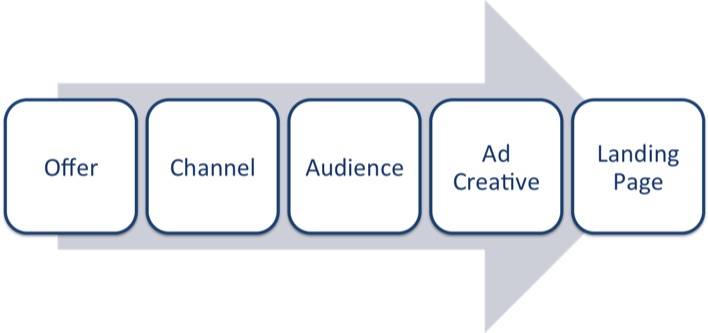
Addressing or changing elements like the ad creative and landing page are far easier than ripping up the offer and starting from scratch. You can A/B test these elements according to commonly accepted best practices (which take all of 5 minutes Googling).
And it's the easiest, 'low hanging fruit' to quickly improve your Quality Score (or similar relevancy scores in other social ad platforms) that deliver fast results.
If issues still persist, take another step back to address the audience you're targeting (or keyphrases in AdWords which inherently have a certain type of audience searching). Chances are, improving audience targeting could give you that breakthrough.
For example, custom audiences on Facebook help you get more specific by targeting segments of past customers, retargeting website visits, or even the individual product page visited. Target saw a “20% increase in conversion [using Facebook's Dynamic Product Ads] compared to other Facebook ads”, according to Senior Vice President Kristi Argyilan.
Assuming your offer or value proposition is sound and that the channel is appropriate, iterating on the audience, ad creative, and landing pages should deliver something at the end of the day.
Otherwise, you have bigger issues (beyond advertising) that are holding you back.
Conclusion
The tactical best practices you read about all over the interwebs are important.
But only to a point.
Breaking things down by sales funnel stages can help you determine where you're excelling or falling short in key categories. They alert you to gaps in the customer journey that can cause breakdowns in driving new sales.
Once that's completed, you can get even more granular by looking at each independent variable within a single ad campaign to see where further bottlenecks are choking results. Working backwards from the ad creative and landing pages to your audience will give your campaigns a quick lift (assuming your offer or value proposition + channel selection check out).
Big conversion increases don't happen overnight by swapping out your headline or button color. They come from iterating on these tiny details along the way, making small improvements at each little step.
And best of all, isolating different variables helps assign priority, keeping execution focused and simple in an increasingly complex world.
About the Author: Brad Smith is a founding partner at Codeless Interactive, a digital agency specializing in creating personalized customer experiences. Brad's blog also features more marketing thoughts, opinions and the occasional insight.