Average site conversion rates hover around 1-2%.
That means at any given time, you have another 98-99% of people just hanging out.
So... WTF are they doing?
They're looking, searching, procrastinating, hunting, browsing, considering, analyzing, evaluating, thinking, questioning, investigating, and comparing.
Basically they're doing a bunch of stuff — besides purchasing — that might, one day, hopefully, lead to a purchase.
Your goal, site owner, is to help move them along.
Here's how.
Are You Treating Different People, Differently?
When a site is struggling with low conversions, one of the first red flags is segmentation.
Or rather, a lack thereof.
(I've always wanted to use that word in a blog post.)
Specifically, are you treating all website visitors more-or-less the same?
The classic example is when AdWords traffic is going to your homepage. Or when your entire email database is seeing the same 'special offer' email.
If the best forms of marketing promotion are the right message, to the right person, at the right time, your website is no different.
The problem is that every single visit or session is unique (to a point). They're different people, with different levels of awareness, looking or searching for different things.
And when generic tactical decisions are applied to all, results suffer. Or are nonexistent.
But fear not. There is a way around this.
The key is to determine:
- WHO is coming to your site (specifically),
- WHY they're coming (motivation),
- WHAT is their intent (what are they going to do when they get there),
- And WHERE are they going to go (the next logical step)
Here's how to figure it out, and where you can improve.
Start Breaking Down Visitor Intent by Buying Cycle Stage
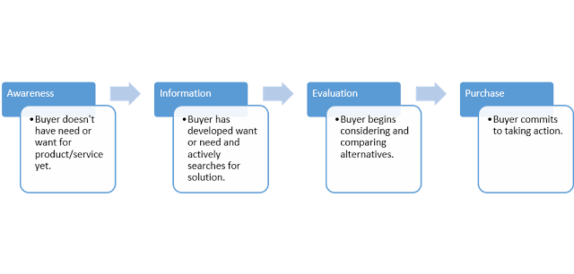
Most savvy readers are familiar with the buying cycle, or stages people go through before making a purchasing decision.
Typically your website visitors fall somewhere along the following:
- Awareness: Although they're beginning to recognize a related topic of interest, many times they still aren't even aware they have a need for your product or service.
- Consideration (or Information and Evaluation): Visitor begins to recognize a potential need for a solution, and is starting to evaluate potential solutions.
- Decision (or Purchase): Here (and only here), is the visitor looking to actively make a decision to work with you in some capacity to solve their problem.
The trick then, is to begin segmenting visitors by determining where groups of people might fit along this path.
Then, we can use this initial knowledge to help hypothesize the rest of the answers.
Awareness
Site visitors in the 'awareness' stage probably make up the bulk of your site traffic (assuming you're doing a lot of promotion and have at least a few thousand monthly visitors), making up anywhere from 40-70%
Because these people aren't need-aware quite yet (they might not even be brand-aware at this point), pimping sales offers is useless.
Instead, they're probably looking for some general information or education about some topic. That's why many of them tend to come into your site through blog posts (again, assuming you're actively promoting your site) and other unbranded pages.
For example, a visitor queries 'san diego restaurant week' and lands on a blog post on your site.
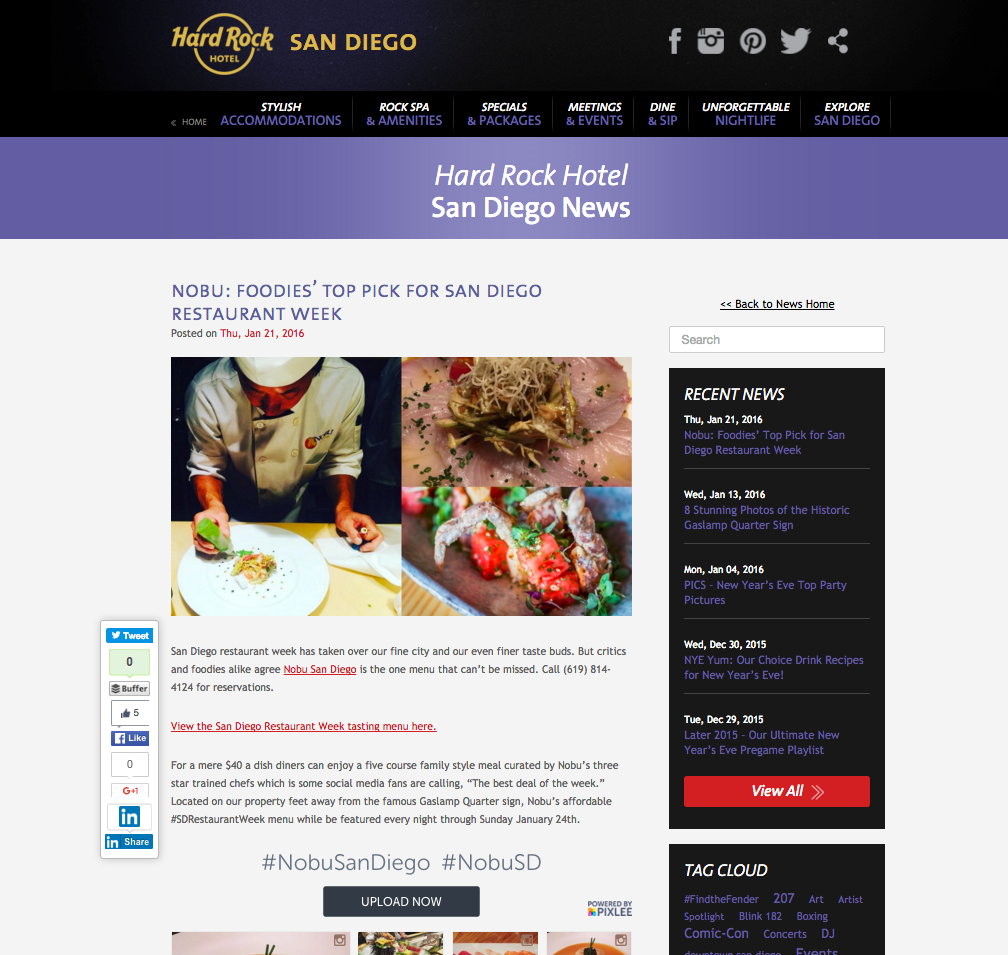
These people are so far removed from being a good sales opportunity, so your goal is to start setting up micro conversions, of different levels, to get something — anything! — from them so you're able to continue following up.
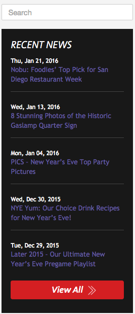
First and foremost, keep them on-site! The Hard Rock's sidebar features a Search bar, followed by Recent News to keep people clicking around (other topically-related content or events in this case).
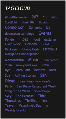
They also feature a Tag Cloud with some of the biggest events also listed, including Comic-Con or the upcoming Valentine's Day.
The blog post itself features other guest's experience with instagram, and provides a way for the casual visitor to see more about the 'scene' or even join the fun themselves.
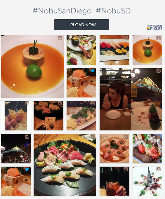
Last but not least, the blog post also features a Menu link to let people (a) browse to learn more and (b) entice them to recognize a need ("Hey – let's go get sushi!").
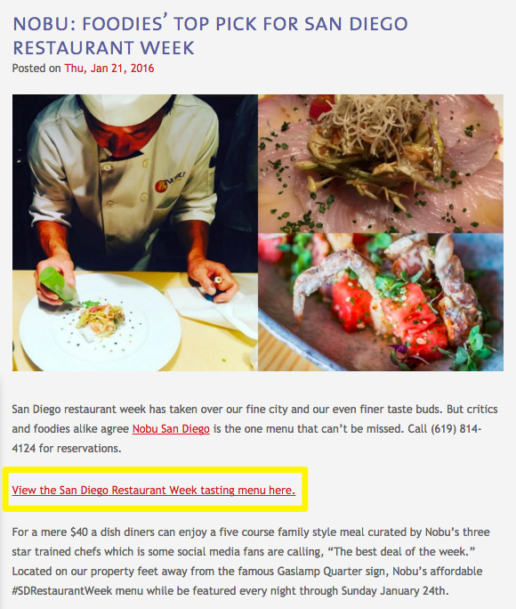
All of these little details have one goal in mind – keep people around long enough so they recognize that need and move into the next stage (of 'Consideration').
And if all else fails, you can use remarketing campaigns, like a restaurant week discount offer, to rope in visitors who're leaving without providing at least an email.
One awesome tip with shared external content is to create a server redirect that will fire a 'website custom audience pixel' within Facebook ads before ultimately redirecting the visitor. Then you'll be able to retarget these people on specific topics after they leave your site.
Check out this detailed guide on Facebook Ads cost if you're interested in figuring out how to get a campaign like this up-and-running.
Consideration
Once people have recognized some need in their life, a tiny little opening has been created that your brand might be able to fulfill.
Generally speaking, somewhere between 10-30% of your site visitors might fall here at any given time (don't check my math).
These visitors are beginning to consider their options and alternatives. Not only are they a little more knowledgeable about what you do at this point, but they're also beginning to recognize the jargon or local slang used to differentiate between things.
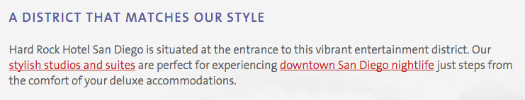
Like, for example, neighborhoods within a city when they Google 'Gaslamp hotels'.
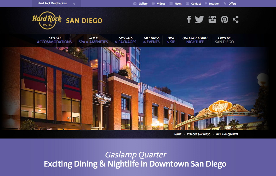
Not only are they looking for a hotel in Downtown San Diego, but they've also narrowed it down to a specific neighborhood, (hopefully) eliminating their other alternatives or options within a few square miles.
These people are ripe for a landing page, covering one specific topic (the one they were looking for!) in detail.
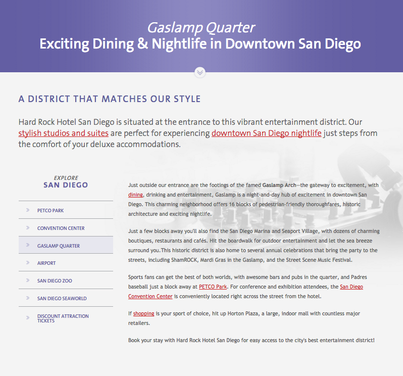
When you've got someone on the hook, you can also use similar landing pages to keep them browsing around for a bit before bouncing. Here, Hard Rock uses the secondary navigation on the left of the content.
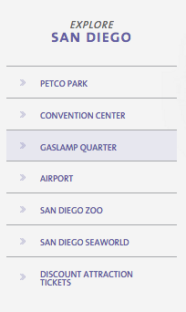
The opening paragraph of the landing page perfectly positions the primary point on the page (wow, that was annoying).
Prominent (there it goes again) links pointing to the Hard Rock's rooms and nightlife options help to take someone who's already evaluating their options deeper into the site while also providing them a chance to show off what differentiates them best (like, a good time!).
Decision
The main reason your website conversions suck is because only around 10% or less of current website visitors might be ready to make a decision.
The rest, as discussed, are chillin.
But the good news, is that these people know you. Chances are, they're looking for you by name with a branded search, like 'Hard Rock San Diego'.
These peeps have looked around. They've considered a few alternatives. And in this example specifically, they've also utilized influential 3rd party sites like Yelp and TripAdvisor.
What better way to tempt someone so close to purchase with a special offer or package.
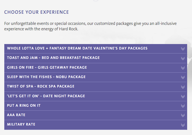
Hard Rock does a nice job highlighting the seasonal (and most profitable) ones first, while following it up with the more heavily discounted stuff at the bottom (so it's there, but... don't the other ones look way more fun!).
The drop downs help you quickly browse through the highlights of each package (even though it might be a bit wordy).

So you're telling me that I don't even have to think about or plan this Hallmark holiday and I can just check-in with my wife while you take care of the rest? Here's my credit card number.
Also, if that red button with decent copywriting (complete with typo – whoops) doesn't entice you, there's a global footer CTA on the bottom of the page that funnels you into their booking system where you're trapped for all eternity. Just kidding. I hope... :(

3 Takeaways to Increase Conversions
Phew. That was a lot of writing to make a very small point.
And that is: A/B testing a single element on a single page won't improve your site's conversion rate.
The way you make big conversion improvements it by making a lot of tiny ones, first.
Here's where to get started.
Tip #1. Make the Basics, Basic
Start by figuring out where you're at within each stage.
You know: user flows, page level user behavior, click tracking, surveys. All the 'blocking and tackling' of basic site analytics.
Then implement 'best practices'. A quick Google will provide amazing resources for all the basics, like the essential "https://blog.kissmetrics.com/landing-page-design-infographic/">landing page elements.
Also, make sure your S#!^ is fast. Ain't nobody got time to wait longer than three seconds for pages to load. Managed WordPress hosting company Kinsta has one of the best guides on the topic, in a Beginner's Guide to Website Speed Optimization.
Oh, also make sure you have enough traffic in the first place. Generally, that means A LOT. Most site owners would be better served by simply pouring more resources into the top of the funnel first, before over-prioritizing conversion optimization.
If you haven't got the basics covered, there's no point in moving on to the advanced stuff.
Tip #2. Form Hypotheses
After analyzing user behavior for a few weeks, the next step is to make some educated guesses about what they want, what's not working, and how you might be able to fix it.
Go on, stick your neck out. Come up with a few likely scenarios.
You may be wrong. But you also may be right. (Where have I heard that before?)
HOW can you improve a visitor's path and get them to logical 'next step'?
Should you remove pages, and make it easier? OR should you add options to increase Pages per Session (so visitors have a chance to become interested before moving onto the next step)?.
Convesrion XL has a thorough 'customer journey maps' guide if you're looking for concrete ideas.
Once you have 'path's and micro-conversions set-up, you can begin to drill deeper to see where stumbling blocks are, or gaps that can be improved.
And because you're focusing on the tiny interactions, it should be easier to iterate or make adjustments
Which brings us to…
Tip #3. Eliminate Distractions
It's impossible to improve overall website conversions from 1 to 2% in one fell swoop.
However it IS possible to begin fixing site conversions from Awareness to Consideration, and then Consideration to Decision. Optimize the little steps within the customer lifecycle to move the big needle.
Breaking it down into manageable chunks not only makes it easier to execute, but it also makes it easier to focus on making the right choices in specific scenarios to set you up for future success.
Execution is everything.
And in a world where options are limitless, constraints help prioritize that the important stuff — the biggest gaps or stumbling blocks along the entire customer journey — are addressed first.
About the Author: Brad Smith is a founding partner at Codeless Interactive, a digital agency specializing in creating personalized customer experiences. Brad's blog also features more marketing thoughts, opinions and the occasional insight.
No comments:
Post a Comment